Hotel Bedroom Colors & Styling: Why Hotels Use White
Hotels don’t just use nice bedding. They style it. The crisp-white-with-accent approach creates a clean, luxurious look that photographs beautifully and feels intentional. The formula: white base layer (sheets + duvet) + textured accent layer (runner, throw, shams) + strategic pillow arrangement. Here’s exactly how hotels build that look, and how you can replicate it at home.
Why Do Hotels Use White Bedding?
Three practical reasons: white sheets can be bleached at 140-160°F for sanitization between guests, stains are immediately visible for quality control, and replacement is simple since no dye lot matching is required. Any white sheet matches any other white sheet. No discontinued patterns to hunt down.
But there’s a psychology angle too. White signals cleanliness, freshness, and luxury. Guest surveys consistently show that rooms with white bedding receive higher cleanliness ratings, even when identical housekeeping standards apply to rooms with colored bedding. White creates a subconscious impression of care.
Modern hotel design (2026 trends) is introducing warm neutrals: ivory, cream, and soft taupe for a softer, less clinical aesthetic. Boutique and design hotels are leading this shift. But crisp white remains the standard at 90%+ of hotel properties worldwide. It works. It’s timeless. And it’s the easiest to maintain.
How Do Hotels Style a Bed? (The 5-Layer Formula)
Hotels build their beds in five layers, bottom to top: (1) mattress pad, (2) fitted sheet with flat sheet tucked using hospital corners, (3) duvet or comforter folded back one-third from the top, (4) pillow stack arranged back-to-front by size, (5) accent pieces at the foot. Each layer serves a specific purpose.
Layer 1: Foundation (Invisible)
- Mattress pad or protector (waterproof, hypoallergenic)
- Featherbed topper in luxury properties
- Everything beneath the sheet is invisible to the guest but essential for the “cloud” feel
Layer 2: Sheets
Fitted sheet: Hospital corners, completely smooth with no wrinkles.
How to do hospital corners: Tuck the excess sheet under the mattress at the foot of the bed. Lift the side panel at a 45-degree angle, tuck the hanging flap under the mattress, then fold the angle down and tuck that under too. Creates a tight, tailored envelope that stays locked all night.
Flat sheet: Laid completely smooth on top. Excess tucked in at the bottom and sides with hospital corners. Hotels use either the “triple sheet” method (flat sheet + blanket + flat sheet, no duvet cover) or the European style (duvet with cover, no top flat sheet).
Layer 3: Comforter or Duvet
Laid evenly across the bed. The top folded back by one-third. This fold-back is the signature hotel detail. It exposes the crisp white flat sheet underneath and prevents the bed from looking “sealed in.” The visual effect: inviting, layered, and ready to climb into.
Layer 4: Pillows (The Stack)
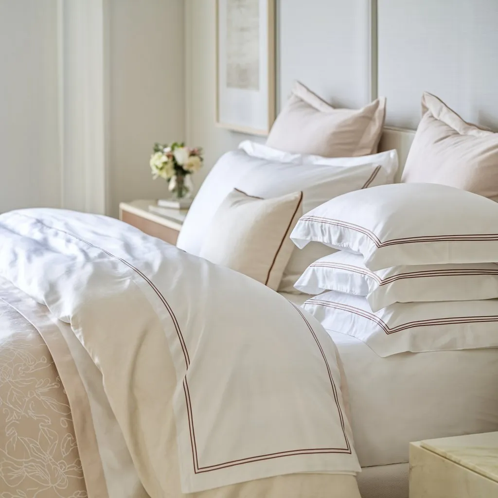
Back to front, largest to smallest:
HEADBOARD
├── [Euro Sham] [Euro Sham] [Euro Sham]     ← 26x26", upright against headboard
├── [Sleeping Pillow] [Sleeping Pillow]       ← Your actual sleeping pillows
├── [Sham] [Sham]                             ← Decorative, matching duvet cover
└── [Accent Pillow / Bolster] (optional)      ← Small decorative touch
Euro shams create height. Sleeping pillows create depth. Decorative shams tie the color story together. The accent pillow adds a finishing touch without clutter.
Layer 5: Accents
- Bed runner at the foot: adds a single color accent and protects the duvet from shoe and bag contact
- Throw blanket: folded neatly or casually draped at the foot for texture
- Decorative pillow: ONE accent pillow adds visual interest. Not fifteen.
Should You Use White Bedding at Home?
White bedding at home works if you’re willing to wash regularly and use OxiClean. It shows every stain instantly (good for accountability, bad if you have kids or pets). White percale actually improves with bleaching and washing. Colored bedding is more forgiving but harder to match when replacing individual pieces.
Pros of White
- Timeless, never goes out of style
- Matches any bedroom decor or wall color
- Can be bleached aggressively for sanitization
- Easy to replace (any white matches)
- Signals “clean” to your brain every time you walk in
Cons of White
- Shows every stain immediately
- Requires more frequent washing (weekly)
- Can look clinical without accent pieces
- Yellows over time without OxiClean maintenance
- Coffee in bed becomes a higher-stakes activity
The fix: Add texture and a single accent color. White base + navy blue throw + textured gray Euro shams = hotel-grade bedroom in three pieces. Total cost under $80. For white bedding care, see our bedding care guide.
How Do You Add Color Without Breaking the Hotel Aesthetic?
Hotels use the 80/20 rule: 80% neutral (white, cream, gray) and 20% accent (navy, deep green, blush, muted gold). The accent appears in ONE place: a runner, a throw, or decorative pillows. Never more than one accent color at the same time.
| Base Color | Accent Color | Mood |
|---|---|---|
| White | Navy blue | Classic, masculine, nautical |
| White | Deep forest green | Luxury, earthy, boutique hotel |
| White | Blush pink | Soft, feminine, contemporary |
| Ivory/cream | Muted gold | Warm luxury, Mediterranean |
| Light gray | White | Modern minimalist, urban loft |
| White | Charcoal | Sharp, contemporary, editorial |
The accent appears in one element: bed runner OR throw blanket OR Euro sham covers OR decorative pillow. Pick one. Not all four. Hotels keep it restrained. One accent color, one accent item. That discipline is what separates “designed” from “decorated.”
See our duvet covers guide for cover options that add style without pattern overload.
Why Do Modern Hotels Use Texture Instead of Patterns?
Hotels use texture instead of prints to create visual interest on an all-white bed. Waffle-knit blankets, linen duvet covers, quilted coverlets, velvet accent pillows. These add dimension without the busy patterns that make bedding look dated within a season.
Textures that work:
- Waffle-knit throw: Lightweight, adds visual depth, casual luxury
- Linen duvet cover: Relaxed, intentionally wrinkled, European boutique feel
- Quilted coverlet: Structured, traditional elegance
- Velvet accent pillow: Richness and warmth without pattern
- Cable-knit throw: Cozy, winter warmth, Scandinavian appeal
Textures to avoid: Printed patterns, paisley, large florals, stripes wider than 1 inch, monograms. All of these age quickly and look dated within 2-3 years. Solid textures are timeless. When you walk into a hotel and think “this looks expensive,” it’s usually because everything is solid-colored with varied texture, not patterned.
Frequently Asked Questions
How do hotels make their beds look so fluffy?
Three things: an extra-fluffy comforter or duvet (hotels size up for more fullness and drape), Euro shams propped upright against the headboard (creates height and visual volume), and the fold-back technique (folding the top third of the comforter down exposes the sheets and makes the bed look layered and inviting rather than flat).
What color bedding is most popular in hotels?
White dominates at 90%+ of hotel rooms worldwide. It signals cleanliness and can be bleached for sanitation. Boutique and design hotels are introducing ivory, cream, and soft neutral tones as alternatives, but white remains the overwhelming standard.
How many pillows should be on a hotel-style bed?
Minimum 4 (2 sleeping pillows + 2 shams). Full hotel presentation: 6-7 (2-3 Euro shams + 2 sleeping pillows + 2 matching shams + 1 accent). More than 7 looks cluttered, not luxurious. Remove all decorative pillows before sleeping. See our pillows guide for the complete setup.
Styling guidelines based on hotel design standards across luxury, boutique, and mid-range properties.